Introduction:
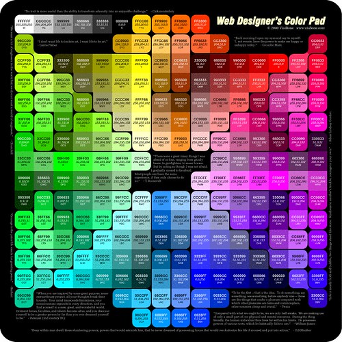
Colors play a vital role in web design, as they evoke emotions, convey messages, and create visual impact. Choosing the right color palette for your website is essential to establish a strong visual identity, enhance user experience, and communicate effectively with your audience. In this blog post, we will explore the role of colors in web design and provide valuable insights on selecting the perfect color palette for your website.
- Branding and Identity:
Colors are a powerful tool to establish a brand identity and create brand recognition. Consistency in color usage across your website helps users associate specific colors with your brand. Consider your brand personality and values when selecting colors. For example, warm colors like red and orange evoke energy and passion, while cool colors like blue and green convey calmness and trustworthiness.
- Emotional Impact:
Colors have the ability to evoke emotions and influence user behavior. Different colors have varying psychological effects on individuals. For instance, blue is often associated with trust and reliability, while yellow is associated with happiness and optimism. Understanding color psychology can help you choose colors that align with the emotions you want to evoke and the message you want to convey.
- Readability and Accessibility:
Color contrast plays a crucial role in ensuring readability and accessibility on your website. Use contrasting colors for text and background to ensure legibility, especially for users with visual impairments. Consider accessibility guidelines, such as WCAG (Web Content Accessibility Guidelines), to ensure your color choices meet the standards and make your website accessible to all users.
- Visual Hierarchy and Focus:
Colors can be used to establish a visual hierarchy on your website, guiding users’ attention to key elements and important information. Utilize colors strategically to create focal points and emphasize specific elements such as call-to-action buttons or important headings. This helps users navigate your website and understand the information hierarchy.
- Cultural and Contextual Considerations:
Colors can have cultural associations and meaning, so it’s important to consider the cultural context of your target audience when selecting colors. Colors may have different interpretations and symbolism across different cultures. Research and understand the cultural significance of colors to ensure your color choices are culturally appropriate and resonate with your audience.
- Consistency and Harmony:
Maintaining consistency and harmony in your color palette is crucial for a visually pleasing website. Use a limited color palette to avoid overwhelming the user and ensure a cohesive visual experience. Consider using color theory principles such as complementary colors, analogous colors, or monochromatic schemes to create a harmonious and visually appealing design.
Conclusion:
Colors have a significant impact on web design, influencing emotions, user behavior, and brand perception. By carefully selecting the right color palette, you can establish a strong brand identity, evoke desired emotions, and create visually appealing websites. Consider your brand personality, user preferences, cultural context, and accessibility guidelines when choosing colors. Strive for consistency, create visual hierarchy, and ensure readability to enhance the overall user experience. By understanding the role of colors in web design, you can make informed decisions and create captivating websites that leave a lasting impression on your audience.