Introduction:
Visual hierarchy is a fundamental principle in web design that guides users through a website, prioritizes content, and creates a visually appealing experience. By strategically organizing elements, designers can effectively communicate information, enhance user engagement, and improve overall usability. In this blog post, we’ll explore the art of visual hierarchy and provide insights on how to master it in web design.
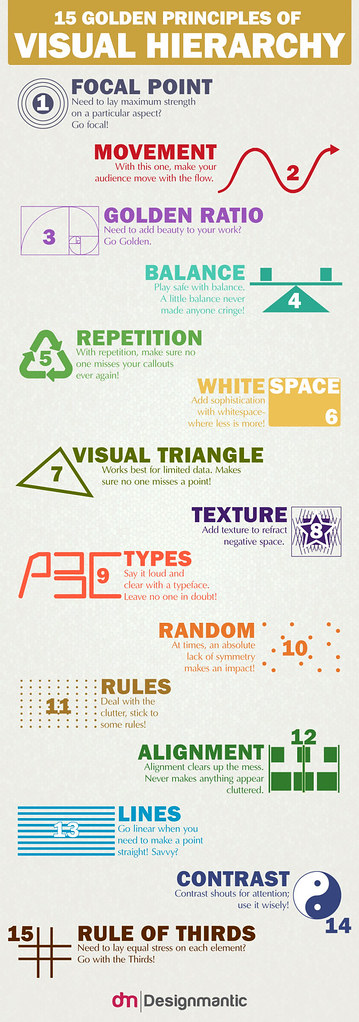
Understanding Visual Hierarchy:
Visual hierarchy refers to the arrangement and presentation of elements on a webpage to guide users’ attention and influence their viewing patterns. It helps users navigate through content, understand the information hierarchy, and make sense of the website’s purpose. The effective use of visual hierarchy can significantly impact user experience and drive desired actions.
Key Elements of Visual Hierarchy:
- Size and Scale: Larger elements naturally draw attention. By making important elements such as headings, key messages, or call-to-action buttons larger, designers can guide users to focus on essential content.
- Contrast and Color: Utilizing contrasting colors, such as pairing dark text with a light background, can create visual impact and draw attention to specific elements. Bright colors or highlights can also be used strategically to guide users to important areas.
- Typography: Varying font styles, sizes, and weights can establish a visual hierarchy. Headings should be more prominent than body text, and the hierarchy can be further emphasized by using different font families or styles for different levels of information.
- Spacing and Alignment: White space, or negative space, helps create visual breathing room and separates elements. Adequate spacing between sections and content aids in distinguishing different parts of the webpage. Consistent alignment also adds to the visual organization.
- Visual Cues and Imagery: Arrows, icons, or other visual cues can direct users’ attention and guide them through the content flow. Relevant imagery and graphics can also play a role in attracting focus to specific areas of interest.
Creating an Engaging User Experience:
- Clear Information Hierarchy: Organize content based on importance and relevance. Use headings, subheadings, and bullet points to structure information, making it scannable and easy to comprehend.
- Focal Points and Emphasis: Use visual hierarchy techniques to highlight key messages, important features, or desired actions. A well-placed and distinct call-to-action button can significantly impact user engagement.
- Consistency and Simplicity: Maintain a consistent visual hierarchy throughout the website to establish familiarity and ease of navigation. Keep the design clean and uncluttered, ensuring that users can quickly grasp the purpose and flow of the webpage.
- Mobile Responsiveness: Consider how visual hierarchy translates to different screen sizes and ensure a seamless experience across devices. Adapt the layout and adjust element sizes for optimal readability and usability on smartphones and tablets.
Continual Evaluation and Refinement:
Mastering visual hierarchy requires a combination of design principles, user research, and iterative testing. Analyze user behavior, gather feedback, and monitor analytics to refine the visual hierarchy and improve the user experience over time.
Conclusion:
Mastering the art of visual hierarchy is crucial for effective web design. By strategically arranging elements, emphasizing important information, and guiding users’ attention, designers can create engaging and intuitive experiences. A well-executed visual hierarchy not only enhances usability but also improves conversions and user satisfaction. Invest time and effort in understanding and implementing visual hierarchy principles, and witness the transformative impact it can have on your web design projects.