Introduction:
Color has a profound impact on human emotions and behavior, and harnessing its power is crucial in website design. By understanding color psychology and applying it strategically, designers can evoke specific emotions, enhance user experience, and convey brand messages effectively. In this blog post, we’ll explore the role of color psychology in website design and how it can influence user perception and engagement.
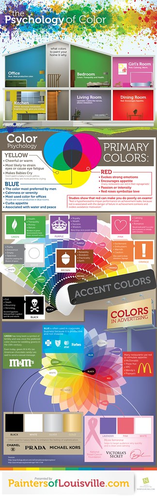
Color Psychology: An Overview
Color psychology studies how colors affect human perception, emotions, and behavior. Different colors evoke unique responses and associations, making them a powerful tool in design. By using the right color palette, web designers can create a visual language that resonates with their target audience and aligns with their brand identity.
Harnessing Color Psychology in Website Design:
- Establishing Brand Identity: Colors play a crucial role in expressing a brand’s personality and values. Consistently using brand colors throughout the website can evoke familiarity, build trust, and reinforce brand identity. Selecting colors that align with the brand’s attributes and target audience creates a cohesive and memorable experience.
- Evoking Emotions: Colors have the ability to evoke specific emotions and moods. Warm colors like red and orange can stimulate energy and passion, while cool colors like blue and green can convey calmness and tranquility. Understanding the emotional impact of different colors enables designers to create desired user experiences.
- Creating Visual Hierarchy: Color can be used to establish visual hierarchy and guide users’ attention. Bright and bold colors naturally attract focus, making them ideal for highlighting important elements such as call-to-action buttons or key messages. Subtle color variations can be used to differentiate sections or convey depth within the design.
- Enhancing Readability and Accessibility: Contrast plays a vital role in ensuring readability and accessibility. Selecting color combinations with sufficient contrast between text and background improves legibility, especially for users with visual impairments. Adhering to accessibility guidelines helps ensure inclusivity and a positive user experience for all.
- Cultural Considerations: Colors can hold cultural significance and vary in meaning across different regions and societies. When designing for a global audience, it’s essential to research and consider the cultural connotations associated with colors to avoid unintended misunderstandings or negative associations.
- Consistency and Cohesion: A harmonious color scheme creates a sense of coherence and professionalism. Careful consideration of color combinations, including complementary or analogous colors, ensures a visually pleasing and unified design. Consistency in color usage across the website enhances the user experience and strengthens brand recognition.
Conclusion:
Color psychology is a powerful tool in website design, influencing user perception, emotions, and engagement. By understanding the impact of different colors and using them strategically, designers can create compelling experiences that resonate with users, convey brand messages effectively, and enhance overall user satisfaction. A well-executed color scheme can leave a lasting impression, differentiate a brand from its competitors, and contribute to the overall success of a website. Embrace the role of color psychology in your web design process, and unlock the transformative potential it holds.